We intentionally moved Lucy into her big girl room months ago so we could reuse
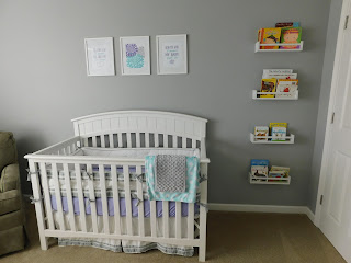
her nursery for when her baby sister arrived. We didn't want to have to buy a second crib so we didn't even convert it into a toddler bed and just put Lucy straight into a twin bed. It was a great decision because she loves her big girl room and since we moved her way back in the winter/early spring, we had plenty of time to change a few things in the nursery to make it special for Cecelia. We kept all the same furniture (crib, glider, dresser, etc.) as well as the layout of the furniture and the paint color but changed the color scheme from pink & gray to purple, aqua, and gray. We bought new bedding, changing pad cover, bins in the cube unit, prints for the wall, and added new maternity photos to the frames. We took down the bunting we had for Lucy, added some floating shelves above the dresser, and hung the prints above the crib. Overall, the room seems a bit more simple than Lucy's but I like the clean look of it and the color scheme is really growing on me.
View of the room from the door
When you walk into the room on the right are the spice rack bookshelves and crib
Another view from the other side of the room
On the other side of the room are the dresser & cube unit (just like we had for Lucy) but we added the floating shelves above
Different view of the same area
Comparisons between Lucy & Cece's nurseries:


No comments:
Post a Comment